Color trends are very much a timestamp of an era. When we reference colors that are trending, we often look to the past to talk about when they were popular, and discuss what we are doing to make use of them in a fresh way. Here are colors we will be pairing in 2016:
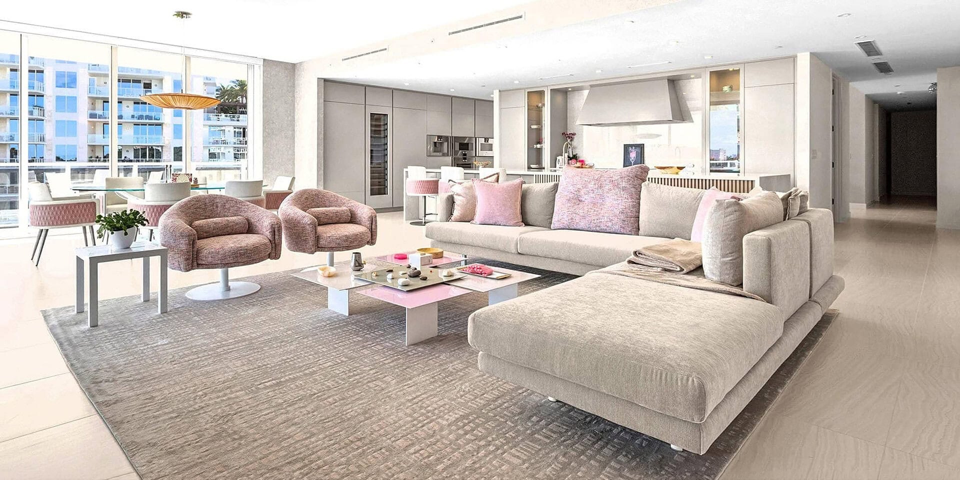
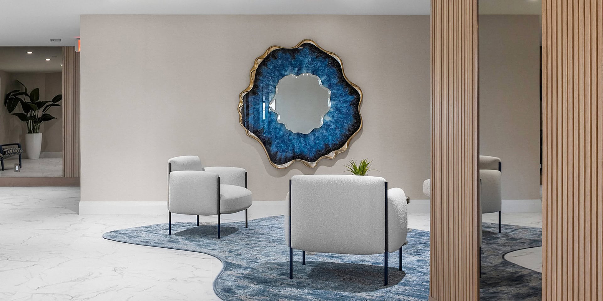
1). Rose Quartz and Serenity: It would be impossible not mention these two since they are Pantone’s Colors of the Year for 2016. Soft pinks and baby blues are perennial favorites for baby rooms, but it is time to see these colors in a new light, as both gender neutral, and sophisticated – after all we can all benefit from the soothing qualities these colors possess. Soft pinks and blues have seen a huge uptake on the runways and now they’re making their way into the home. Selected for their soothing properties, Rose Quartz and Serenity can be used purposefully in bedrooms and living rooms. If you don’t want to go overboard with the colors in one room, pair them with a neutral base and then use pops of them in accessories like candles, throw blankets and rugs.
2). Mixed Metallics: Metallics have the tendency to remain on trend. They are neutral enough to play well with other elements in the room, but also add a layer of playful sheen and texture. Every couple of years we see a specific metallic take the spotlight– for example, 2014 saw brass (once deemed a relic of the 80s) make a big comeback, while silver and gold remained staples for the home. What’s awesome about 2016 is that after we’ve collected metallics in different shades and finishes, it is time to embrace them all at once – we’re even seeing them printed on textiles! A simple way to add some mixed metallics to your home is with the Kartell Cindy Table Lamp. These simple lamps come in a variety of metallized shades that pair nicely together.
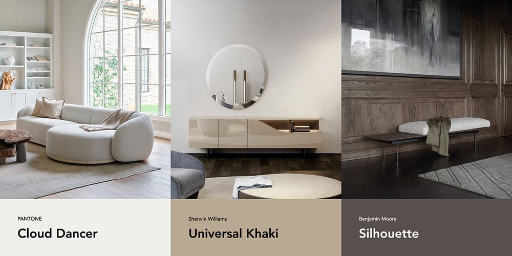
3). Coffees and creams: We expect neutral pallets (soft creamy whites, rich, earthy, coffee and chocolatey tones) to quietly take-off in 2016. Nineties-inspired clothing has been ever-present in fashion the last couple of years and we are expecting the decade’s influence to trickle its way into interior design. The earthy, neutral pallets we welcomed into our homes 20 years ago had a soothing quality, and at the time served as a remedy to the revved up pace of the 80s. Some early indicators that the 90s neutral pallet is back? The popularity of light colored woods and all-white kitchens. For a fresh and crisper take on this pallet, add pops of citrus-hued greenery into the room. It will keep the space looking fresh and the furthest thing from boring-beige.
Images courtesy of Niche Interiors and Tobi Fairley.
